Documentation format
The wiki uses MDX files as its documentation format. In additon, GitHub Flavored Markdown
(GFM) is also available using remark-gfm.
If you're not yet familiar with MDX, don't worry - it is an extension of the simple Markdown format with added JSX capabilities, meaning you can include fancy custom components in your documentation, such as crafting recipes.
These features are purely optional, and you can always stick to using standard Markdown in your documentation. However,
the file extension must remain .mdx.
Limitations
Because MDX can potentially allow unwanted code injection on the server, we sanitize all sources before they're rendered, which can result in certain features of MDX being unavailable. That said, if there's a safe feature you'd like to use in your documentation that isn't available on the wiki, please open an issue on our GitHub repository.
Metadata
Markdown page metadata, also known as simply "Frontmatter" is used by the wiki to provide additional information about a page or in-game content. It's located at the very beginning of each file in YAML format.
Information obtained from frontmatter is then displayed in the right sidebar of each page under "Information". Usually, this includes an icon of the block/item along with its name, id, source mod and other handy information.
If your page is not related to a specific object, you can hide all metadata and ignore their values by setting
hide_meta: true. The title attribute will still be used, and we recommend providing it at all times.
---
title: Hello World
---

Content comes here
Here's an overview of supported attributes:
title- Display name of the page, shown in the content heading and the browser tab title. Replaces theh1heading in docs.- Type:
string - Example:
Fancy Block
- Type:
hide_meta- Hides sidebar meta information. As a results, all other attributes will be ignored.- Type:
boolean
- Type:
id- In-game resource location ID of the content shown. If a matching asset with the same location is found in the documentation root's asset folder, it will be used as theicon.- Type: Resource Location
- Example:
examplemod:generator
icon- Resource location of an asset that will be shown as the documented item's icon. Its size should be at least 128x128 pixels.- Type: Resource Location
- Example:
examplemod:fancy_generator
hide_icon- Hides the project icon, showing a generic placeholder instead.- Type:
boolean
- Type:
type- Can beblock,itemorother- Type:
string
- Type:
custom- A map of custom attributes you wish to display in the sidebar.- Type:
string->stringmap - Example:
custom:
  Category: Machines
- Type:
Show complete metadata example
---
title: Generator
id: examplemod:generator
icon: examplemod:fancy_generator
type: block
custom:
  Subcategory: Machines
---

Content comes here
Custom components
The wiki adds a selection of useful components that you can use in your documentation.
Import statements are not required for built-in wiki components.
Heads up!
Didn't find what you were looking for? Head over to our GitHub repository and open a new issue or pull request proposing your desired component!
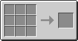
Crafting recipe
slots- Exactly 9 resource location strings (asset names), in order from top-left to bottom-right.result- Resource location of the resulting item assetcount- Optionally, specify the output item amount
※ Images shown in crafting recipes are sourced from documentation assets as described here.
<CraftingRecipe
    slots={[
        'flint',
        'minecraft:flint', // Hint: the namespace is optional for 'minecraft' items
        'flint',
        '',
        'iron_block',
        '',
        '',
        'diamond',
        ''
    ]}
    result="furnace"
    count={4} // Optional
/>
Results in:

Callouts
Draw the reader's attention with callouts.
Available attributes:
variantOptional; can be either of [default,info,warning,danger] (default:default)
<Callout>
    This is a sample callout
</Callout>

<Callout variant="info">
    This is a sample info callout
</Callout>

/* Other variants shown below */
Results in:
Heads up!
Info variant:
Heads up!
Warning variant:
Heads up!
Danger variant:
Heads up!
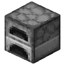
Mod Asset
Displays an asset image.
Available attributes:
locationRequired, Resource Location of the asset you wish to display- All properties of
imgexcept forsrcare accepted
<ModAsset width={64} height={64} location="minecraft:furnace" title="Force Field Projector" />Results in:

Icons
The entire collection of Lucide icons is available to use in documentation files via React components.
Names of icon components consist of an icon's "component name" (which you can find on the website or make an educated
guess by converting the icon id to PascalCase (e.g. align-vertical-justify-start -> AlignVerticalJustifyStart)
and the Icon suffix. All properties supported by Lucide React are
available as well.
For example:
<SquirrelIcon width={64} height={64} strokeWidth={1.5} />Results in:
Next steps
Once your documentation folder is set up, and you're satisfied with the looks and content of your documentation, it is time to get it published on the wiki.
➡️ See the Publishing page for more information.